Electronic Bulletin Board
Following the 2010 merger of United and Continental Airlines, flight attendants continued to operate on separate, outdated systems. One platform offered granular functionality but a poor user experience, while the other had a modern UI but lacked critical tools. In 2017, work began on the Electronic Bulletin Board (EBB)—a unified system designed to support over 20,000 flight attendants with a seamless, intuitive interface.
My team played a key role in user research, persona development, wireframing, and UI design, ultimately building front-end packages to ensure developers had pixel-perfect implementations. Through collaboration, iteration, and overcoming technical limitations, we created a system that modernized crew operations while respecting legacy constraints.
Team
- 5 - Designers
- 2 - Business Analysts
- 6 - Association of Flight Attendants
- 10 - Developers
- Leadership
My Objectives
- Unify flight attendants under a single operational platform.
- Conduct user research to understand workflow pain points.
- Develop low-fidelity prototypes and gather user feedback.
- Build high-fidelity designs and front-end development packages.
- Iterate based on feedback to refine the final experience.
With two disparate flight attendant systems in place, operational inefficiencies were rampant. One system had strong functionality but poor usability, while the other had a modern interface but lacked critical tools. This created frustration, inconsistencies, and difficulty in daily operations.
To successfully replace these systems, we needed to:
Our goal was to streamline workflows, improve accessibility, and create a tool that flight attendants could rely on daily.
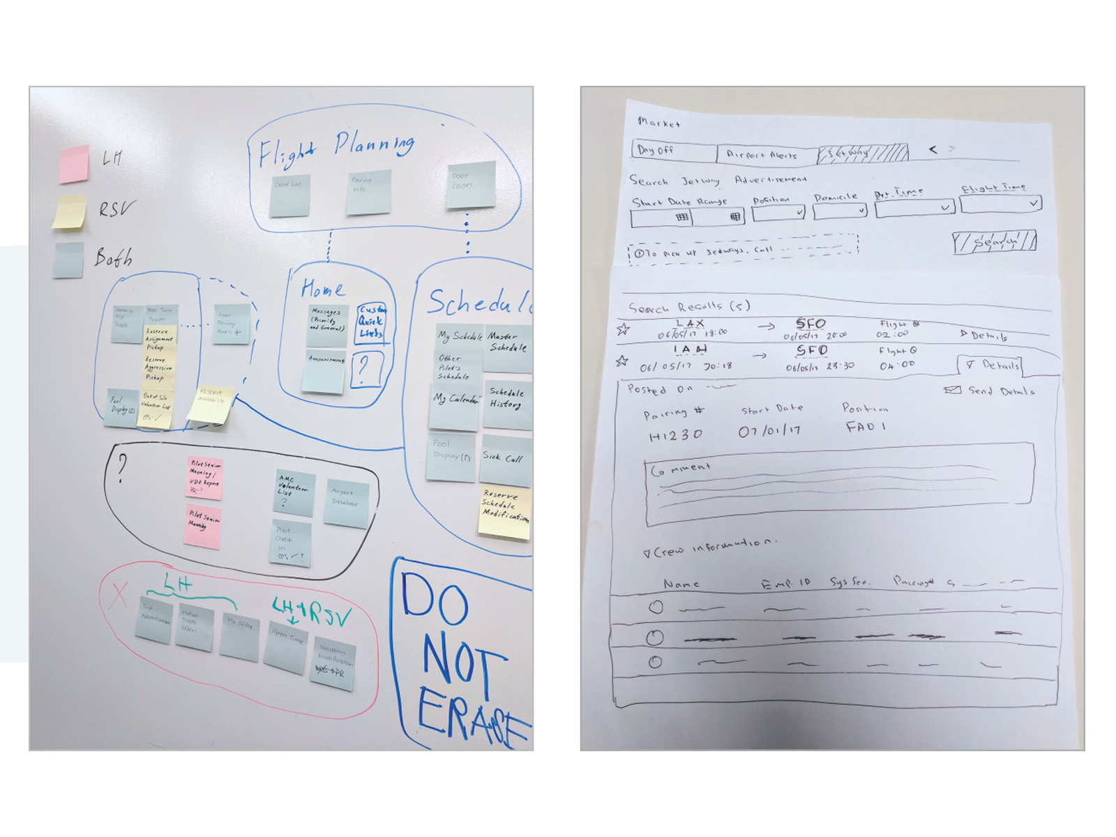
To build a user-centric solution, we took a multi-pronged research approach:


These insights informed the creation of Journey Maps, Personas, and early concept designs, helping us define the ideal user experience for EBB.


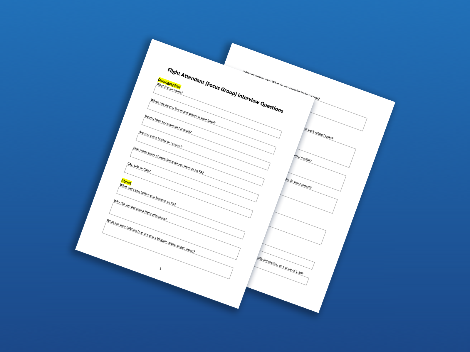
With research in hand, we built a low-fidelity prototype and recruited a user testing group of six flight attendants provided by the AFA. This group represented a diverse mix of age, seniority, and goals, ensuring we designed for a broad range of user needs.

As development progressed, we discovered that many UI elements were not being implemented as designed—colors were off, grids were inconsistent, and components didn’t function as expected.
To bridge the gap, we:
This shift streamlined the implementation process, reducing inconsistencies and improving development efficiency.


Building a platform for 20,000+ daily active users came with immense challenges. Not every update was met with enthusiasm, and we quickly realized that understanding user frustration was key to success.